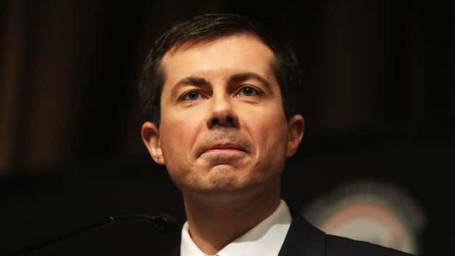
On Monday, the former McKinsey consultant, Afghanistan combat veteran, mayor of South Bend, and now presidential candidate Pete Buttigieg, who has clawed his way up early polls despite—or as is more likely, because of—his aversion to pesky things like policy details, debuted a new logo, a shiny new website, and a design toolkit meant to allow his “grassroots movement” to create their very own Mayor Pete swag.
It’s certainly telling that Buttigieg has made the choice to focus on branding before releasing even a list of policies he would want to push—another sign that Buttigieg cares more about projecting a certain image than anything of actual substance, a posture that’s reflected in how he talks about his unwillingness to put forth detailed policy ideas. (His apparent reluctance to do so may be partly based on the fear that voters may not like what they have to see once they drill down into his political past as mayor.)
“I’m very specific on policy. I just think that we need to talk about values first. You can’t just expect people to be able to derive your values by looking at the minutiae of your policy proposals,” he told New York magazine in an odd exchange. (One can certainly figure out what someone values by looking at the ideas they support.) And in an interview with VICE News, he made that point again, as transcribed by Nathan Robinson of Current Affairs:
VICE: I listened to you talk today. On the one hand, you definitely speak very progressively. But you don’t have a lot of super-specific policy ideas.
BUTTIGIEG: Part of where the left and the center-left have gone wrong is that we’ve been so policy-led that we haven’t been as philosophical. We like to think of ourselves as the intellectual ones. But the truth is that the right has done a better job, in my lifetime, of connecting up its philosophy and its values to its politics. Right now I think we need to articulate the values, lay out our philosophical commitments and then develop policies off of that. And I’m working very hard not to put the cart before the horse.
VICE: Is there time for that? They want the list. They want to know exactly what you’re going to do.
BUTTIGIEG: I think it can actually be a little bit dishonest to think you have it all figured out on day 1. I think anybody in this race is going to be a lot more specific or policy-oriented than the current president. But I don’t think we ought to have that all locked in on day 1.
Given that Buttigieg seems to be actively cultivating the image of an empty, if charming, vessel upon which all manner of voters can project their own ideas of what he stands for and what they want in a candidate, it’s worth looking at what exactly Buttigieg the man is trying to express with Buttigieg the brand.
The head of Buttigieg’s design firm has explained what they were hoping to achieve with this visual rebrand of Mayor Pete. “Our position is just that when you’re branding a candidate, the most important thing is to reflect who that person is,” Deroy Peraza told Fast Company. His color palette? “Those are the colors that authentically surround him,” Peraza said, adding, “Lead with that story”—the story of Pete himself—“rather than focusing on whatever sector or space they’re working within.”
Here’s his new logo, by the way, featuring the colors “Claeys Cream,” “River Blue,” and “Heartland Yellow,” all nods “to Pete’s hometown and his life there,” according to his campaign website:

It’s clear Americana—and as Lindsay Ballant, the art director for the Baffler, wrote on Twitter of Buttigieg’s logo, that retro look is intentional. It is, she wrote, meant to evoke notions of blue-collar, middle America, a look that is “muddled” due to the myriad of designers “using industrial-era type and imagery for anything these days.”
But what do others think of Pete Buttigieg™? I’m no design expert, so I reached out to several other designers and experts for their thoughts. And without fail, their thoughts were… not kind.
Debbie Millman, the acclaimed illustrator, design expert, and host of the podcast “Design Matters,” was blunt (emphasis my own):
The font choices are erudite and elegant (you can’t really go wrong with just about anything in combination with a typeface designed by Dalton Maag). But the “Pete” logo looks more like a back pocket tag for a pair of jeans than a Presidential candidate.
Ramon Tejada, an assistant professor of graphic design at the Rhode Island School of Design, offered up some subtle shade regarding Buttigieg’s font choices, which his website proclaims “[pay] homage to America’s industrial legacy, to Pete’s ability to convey substantive ideas plainly, and to his bold vision for a modern America that reaches for the future with focus and clarity.” Again, emphasis my own:
What I find interesting is that Mayor Pete, in his announcement speech, alluded to looking towards the future and towards something new, someone new. Ironically, this typographic language looks towards the nostalgic past in particular 20th-century typographic ideas.
And Jacin Greenhill, who is the director of design at the company where my roommate works, had a LOT of thoughts on the identity that Buttigieg is trying to project:
It seems that he is attempting to portray a “wholesome” or ethical image. In this instance it’s a bit problematic because the identity/toolkit lacks personality and a clear idea for what he represents. While colorful it’s actually quite bland unfortunately. As he is a self professed, progressive, pragmatic, openly gay millennial presidential candidate I’d hope that could have been represented in the brand tool kit he’s developed. When reviewing the toolkit itself it’s really more akin to something from the John Deere guidelines than anything else.
Greenhill continued: “The lack of personality in the branding sends the message that this will be the type of presidential candidate we can expect—lack of personality and middle-of-the-road politics.”
Our very own Chelsea Beck, an illustrator at G/O Media (in case you didn’t see the news—surprise!) had this to say about the toolkit:
This is a bonkers design toolkit and all of it in practice is fucking huge for no reason.
The toolkit, by the way, which Buttigieg’s website stresses is all about empowering his “grassroots movement,” isn’t quite so grassroots when you take a look at it. If a supporter wanted to, say, use the campaign’s fonts to make their own Buttigieg swag, they’d have to pay for them, giving it all the feel of a top-down branding campaign. (As Ballant noted on Twitter, “[A]ttempting to institute control over your image is at odds with building a grassroots movement.”)
In short, Pete Buttigieg the brand, from his fonts to his “grassroots” toolkit to his logo, does exactly what font designers Tobias Frere-Jones and Nina Stoessinger told Jezebel candidates attempt when making design choices—though based on the responses Jezebel received, his branding is perhaps not quite having the effect that he intended. (Frere-Jones and Stoessinger did not comment directly on Buttigieg.)
Frere-Jones and Stoessinger, whose company has created several of the fonts that are currently being used by presidential campaigns, explained the thinking behind candidates’ design choices; while they focused on typography, what they wrote could easily be extended to all visual branding. “The choice of type is driven by the personality and strengths of the candidate (or more accurately, how they are presented by the campaign), as well as the sensibilities of the audience they aim to appeal to,” they explained.
Frere-Jones and Stoessinger continued:
Type can set a mood and reinforce a message; by delivering it in an appropriate and appealing tone, well-chosen type can help evoke the desired emotional response. Type that suits one candidate may not suit another. Blunt, hopeful, traditional, experienced, young, strong, thoughtful: expressing and emphasizing any aspect will suggest a different direction for the type.
Bland, somewhat muddled, basic—his branding is, in short, a perfect encapsulation of his campaign as well as his ideology. I couldn’t help but think of one anonymous Democratic consultant’s comment to New York: “He has an eye for making his brand seem bigger and larger than it is. And eventually, if you fake it enough, that becomes true. Everything he’s projecting makes it look like a real campaign.” In Buttigieg’s deployment of a confused, forward-thinking nostalgia under the veneer of progress, he’s made himself the human equivalent of a Shinola watch. Unfortunately, it’s also proving itself effective, at least with a certain segment of voters.